Corporate Rebrand
This project is the initial phase of a mass corporate rebranding project for the FLD Inc. I was contracted to collaborate with a team of internal and external CMO with the objective to come up with a new logo, corporate brand identity, and have a launch version of the new company website by an important deadline.
FLD Inc. is a national fleet remarketing company who works with all types of vehicles, but predominantly deal with commercial and work vehicles. They purchase fleets of vehicles that businesses are don't utilize anymore and remarket them to another business. They also offer various maintenance and technological services to help businesses manage their vehicle fleet.
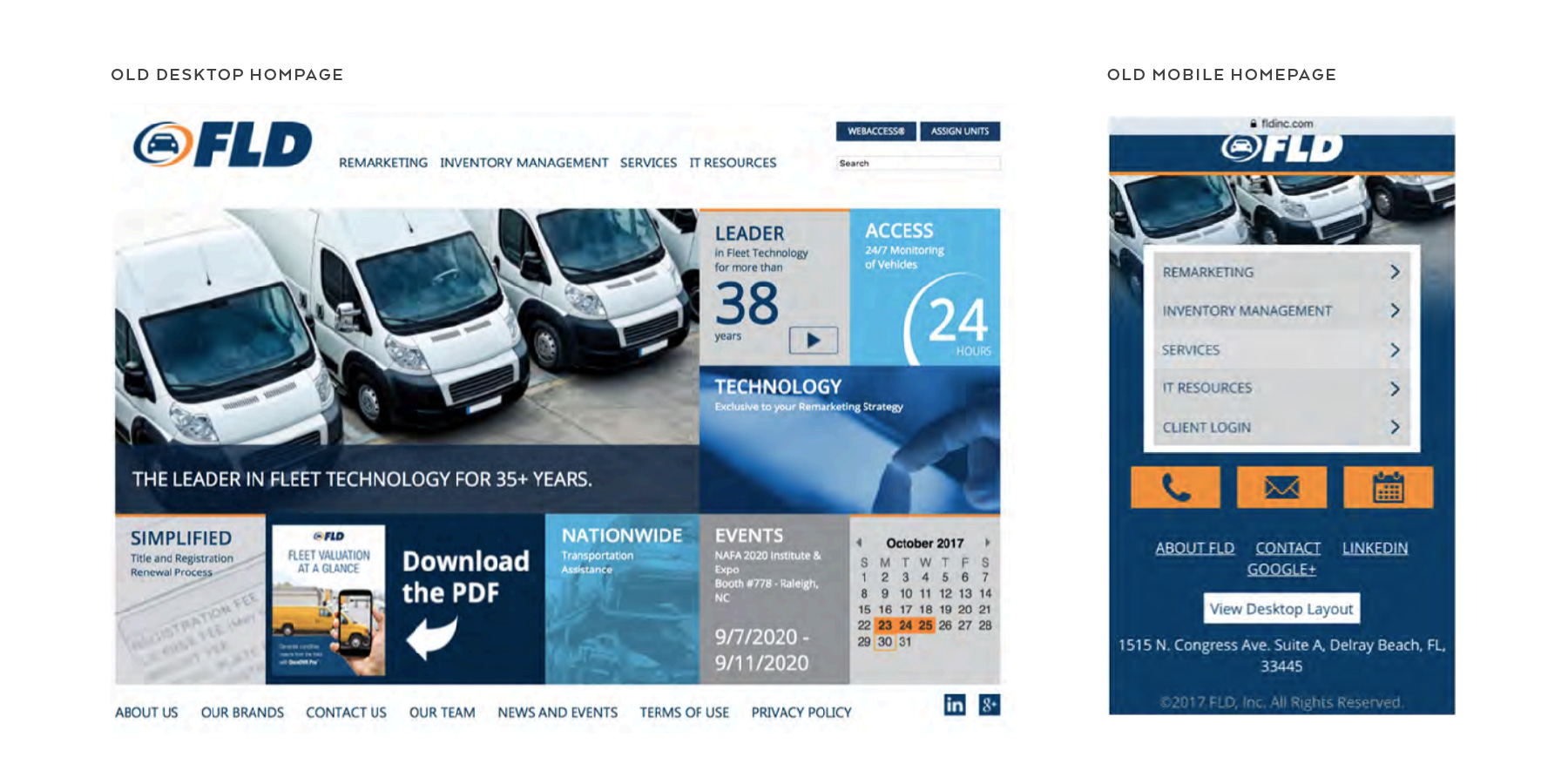
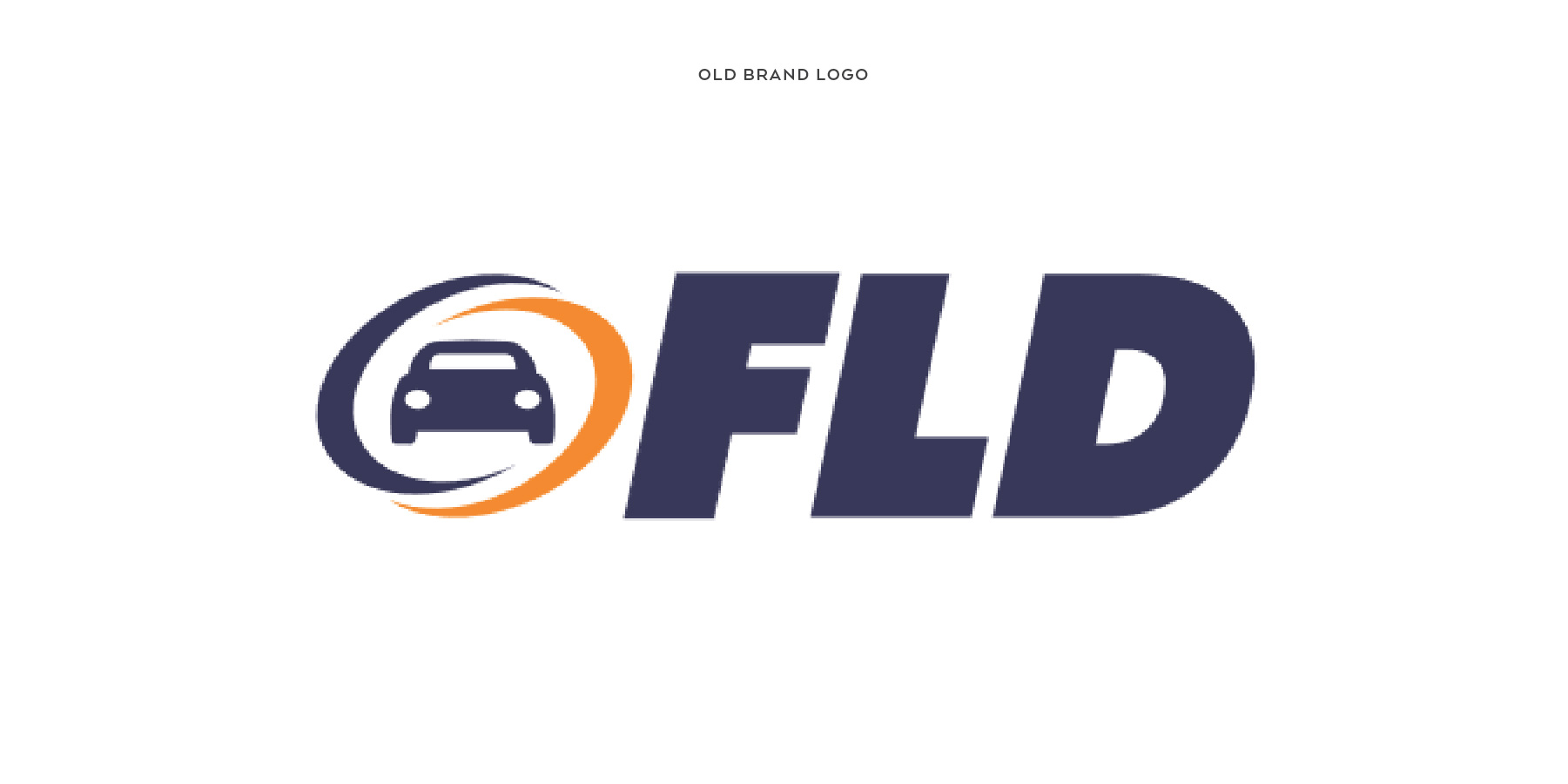
The images above and below are examples of company's original website design. Looking static and outdated, as well as the company's 40-year anniversary coming soon, FLD Inc. decided it was time to refresh their brand image.
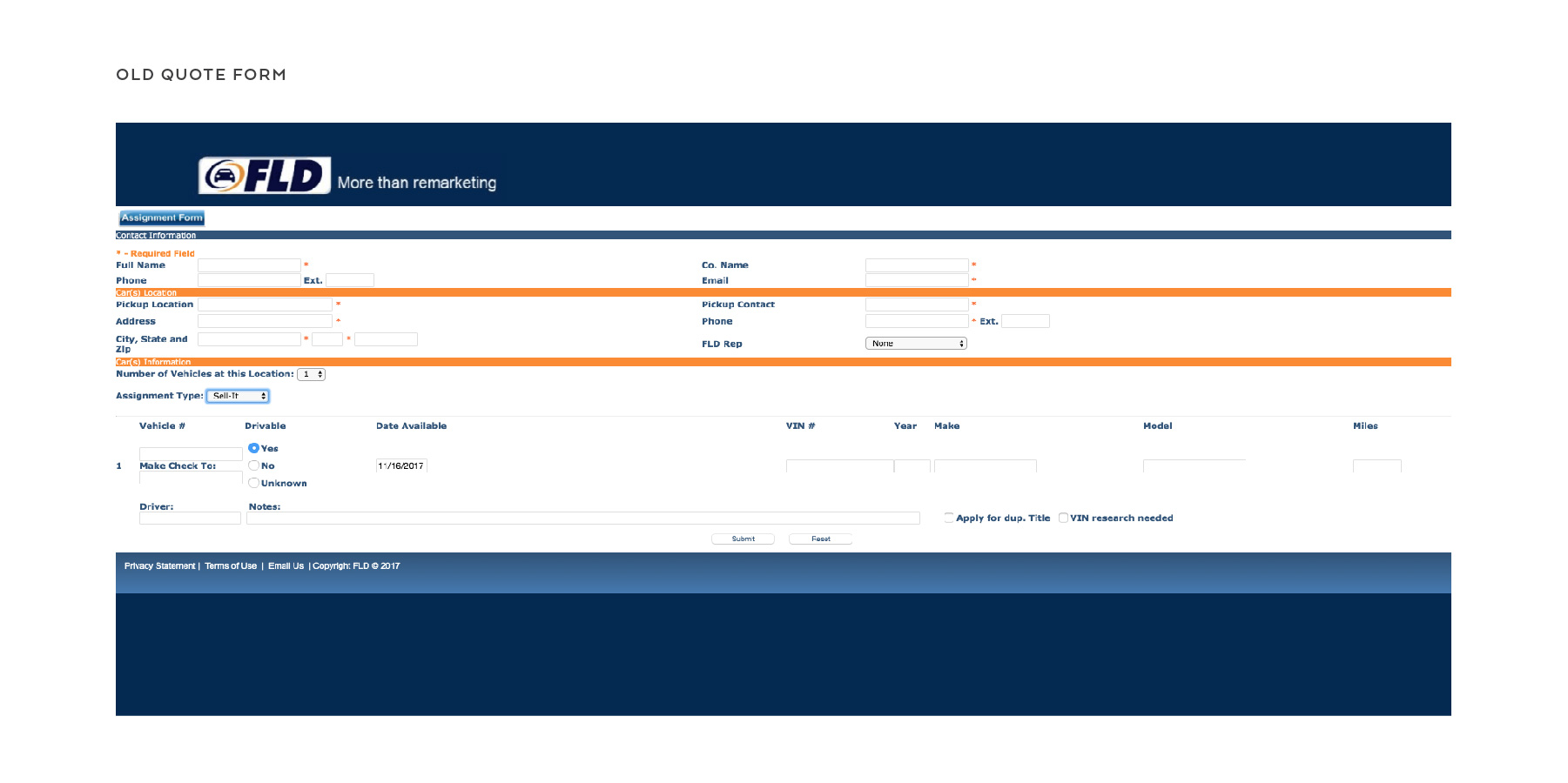
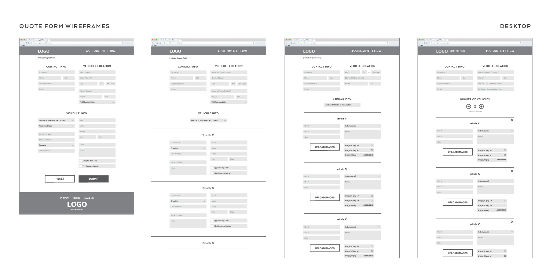
This is an image of the online quote form current customers and prospective clients often use to send quotes for their vehicle fleet to FLD Inc. It's an essential part of their operations and a way for the company to initiate conversation with a potential customer and specifically fulfil their needs. The form was too cluttered and visually confusing, and the company was looking to make it simplified and more appealing to work with.
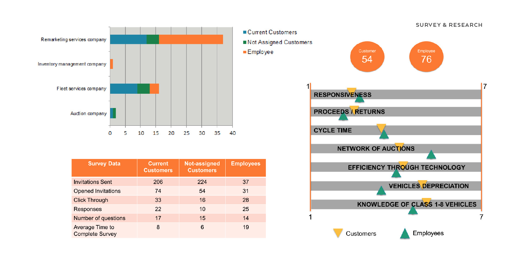
The rebranding team conducted surveys for current company employees, currents clients, and former clients. The objective was to try to understand their frame of reference for FLD Inc., how they rank the company under certain criteria, customer challenges, and likeness to refer the company to others. The data pulled from the research provided a more comprehensive insight on the company’s position in the industry and how they were viewed amongst employees and clients. This allowed the company to pursue a new corporate business strategy relevant to their rebrand.
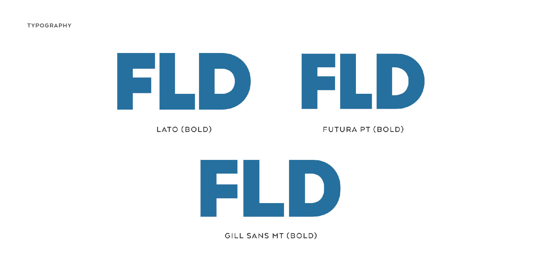
I explored varying typefaces for the company logo. Although the first phases of the project were predominantly research and market analysis, I was also coming up with basic initial concept designs for the new company logo. FLD Inc. had a well-established brand within their industry, so it was decided that the new logo wasn't going to deter too far from the original design so that the brand retains their recognition.
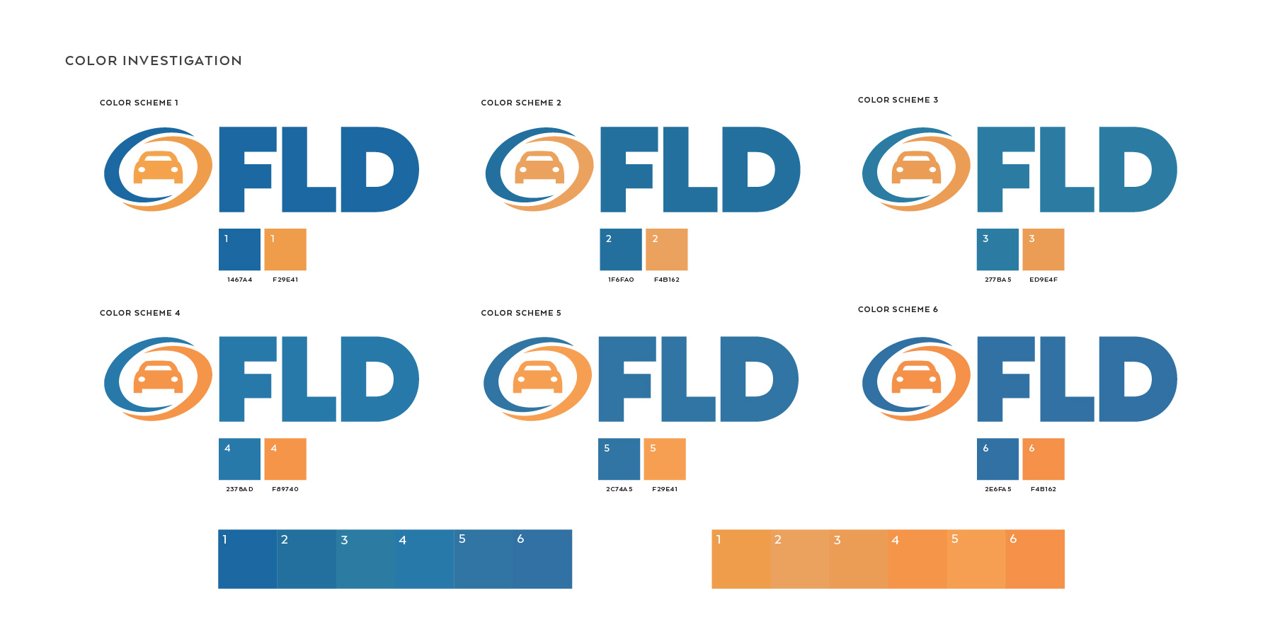
This image illustrates a brief overview of the color experimenting and investigation I underwent to select the new brand colors. FLD Inc. wanted to keep their colors blue and orange but change the type of blue and orange. From earlier examples of their original brand, their previous colors were darker and bolder. The company was looking for dial down the intensity and use brighter tones for their new brand colors. Here I still utilized the original brand logo to focus more on the color choices.
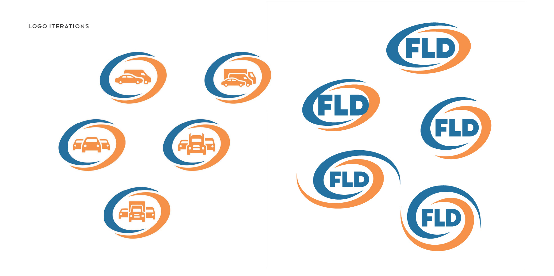
As part of maintaining that recognizable brand, the blue and orange "hurricane" in the logo was iconic to the company and they wanted to continue having it. The challenge on my part was designing the icon that would go inside. At first, I was focused on trying to convey the fact the company works with a variety of vehicles, from commercial automobiles to tractor trucks. However, at some point in an attempt to simplify the brand, instead of having the logo and company name as separate entities, I combined the two by putting the name inside of the logo. This image illustrates some examples of those iterations that I came up with overtime.
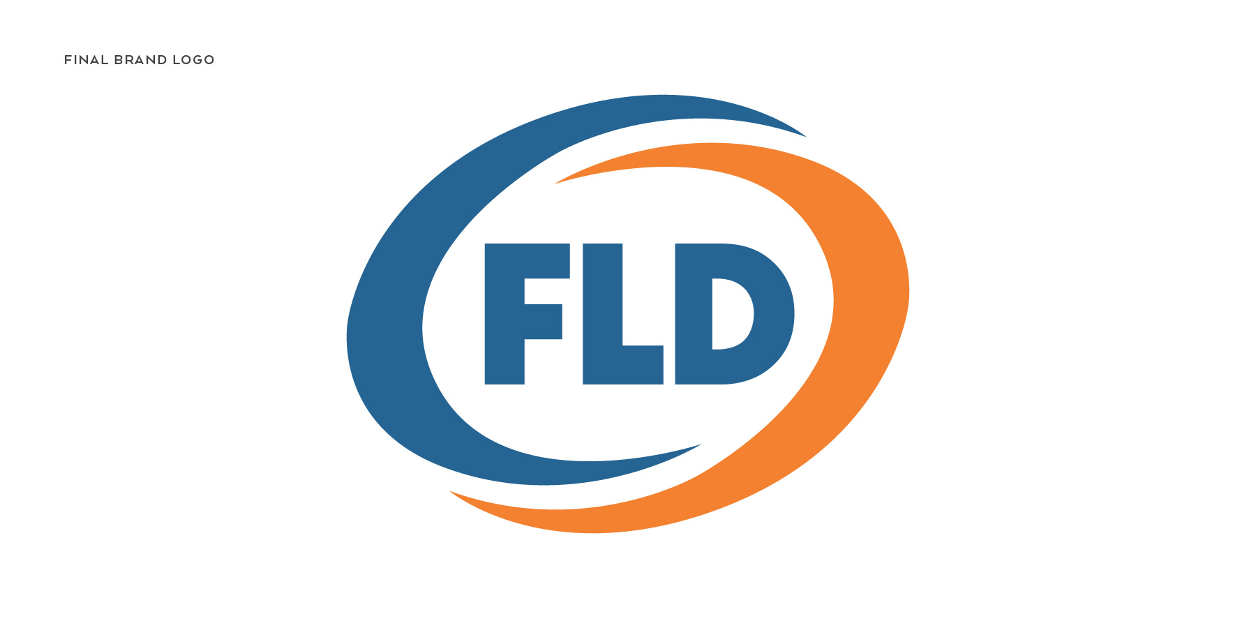
To my surprise, the simplest solution turned out to be the most popular choice. The logo design still held tribute to their original brand identity while providing that newer, simpler, and fresher image the company was looking for.
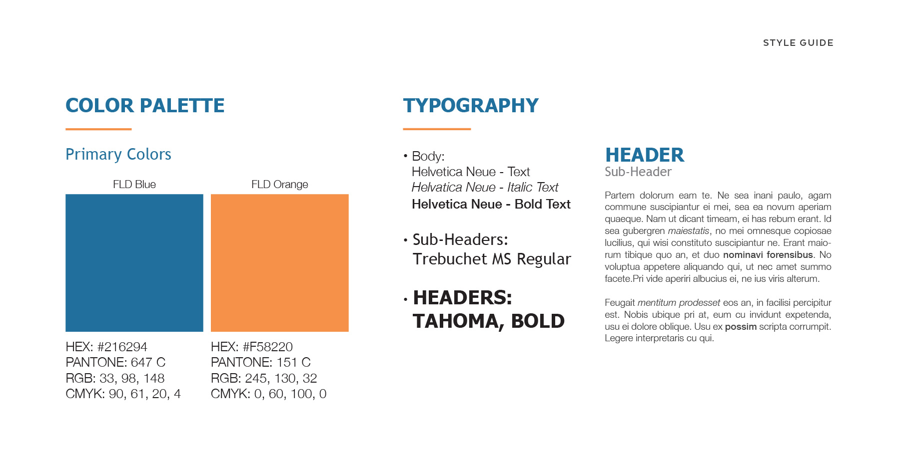
A brief style guide I designed for the company's new brand colors and typography. At this point during the process I was already proposing and revising designs for the website layout, so setting a typographical system was necessary.
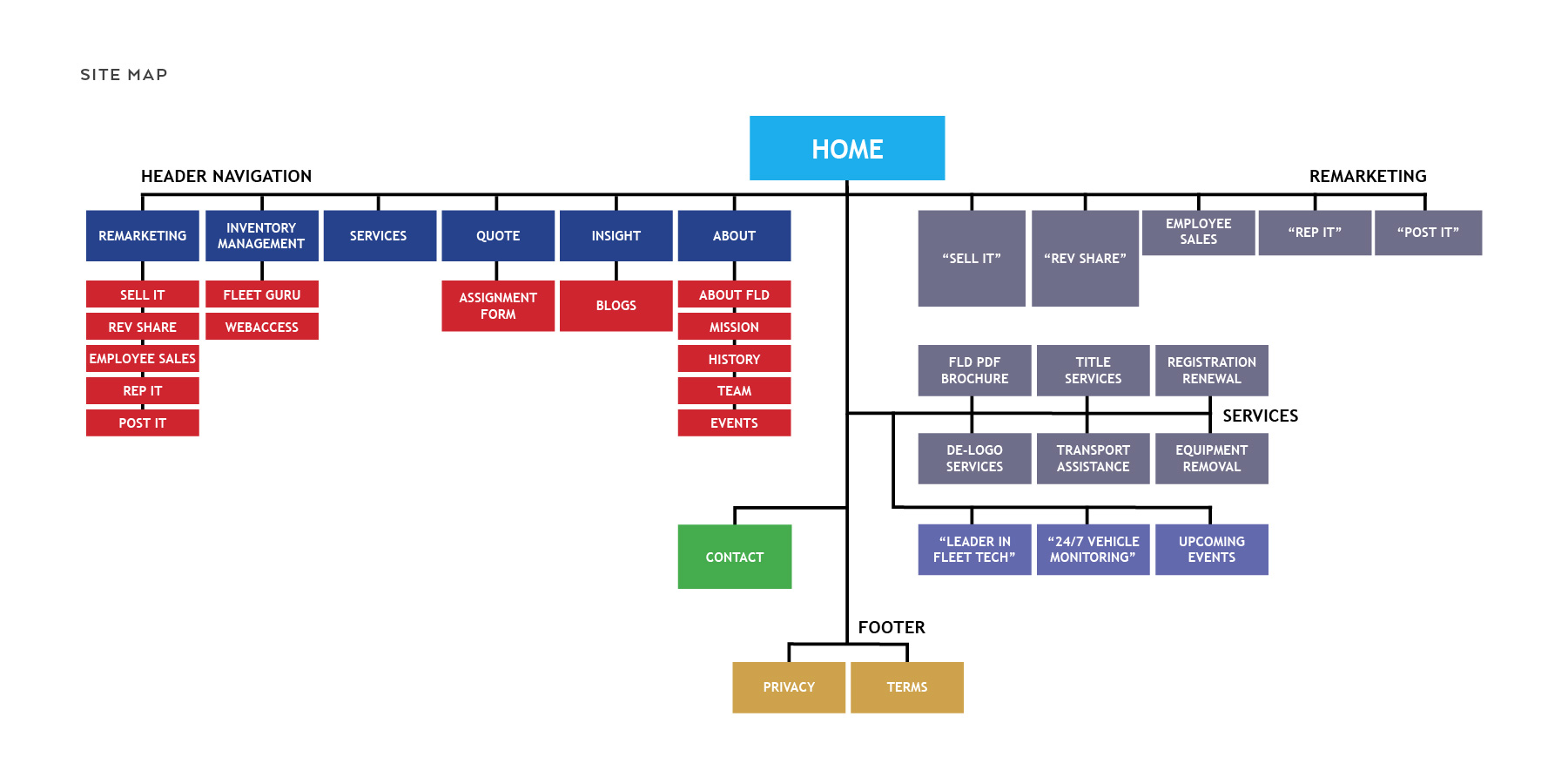
I designed a site map for the new website and worked with rebrand team to organize the content hierarchically according to importance and ease of accessibility.
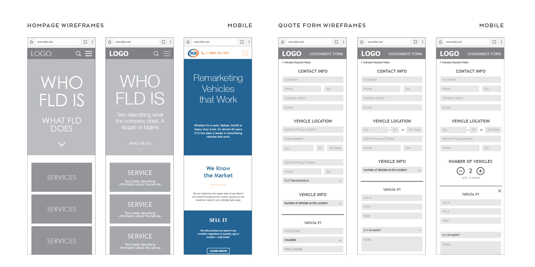
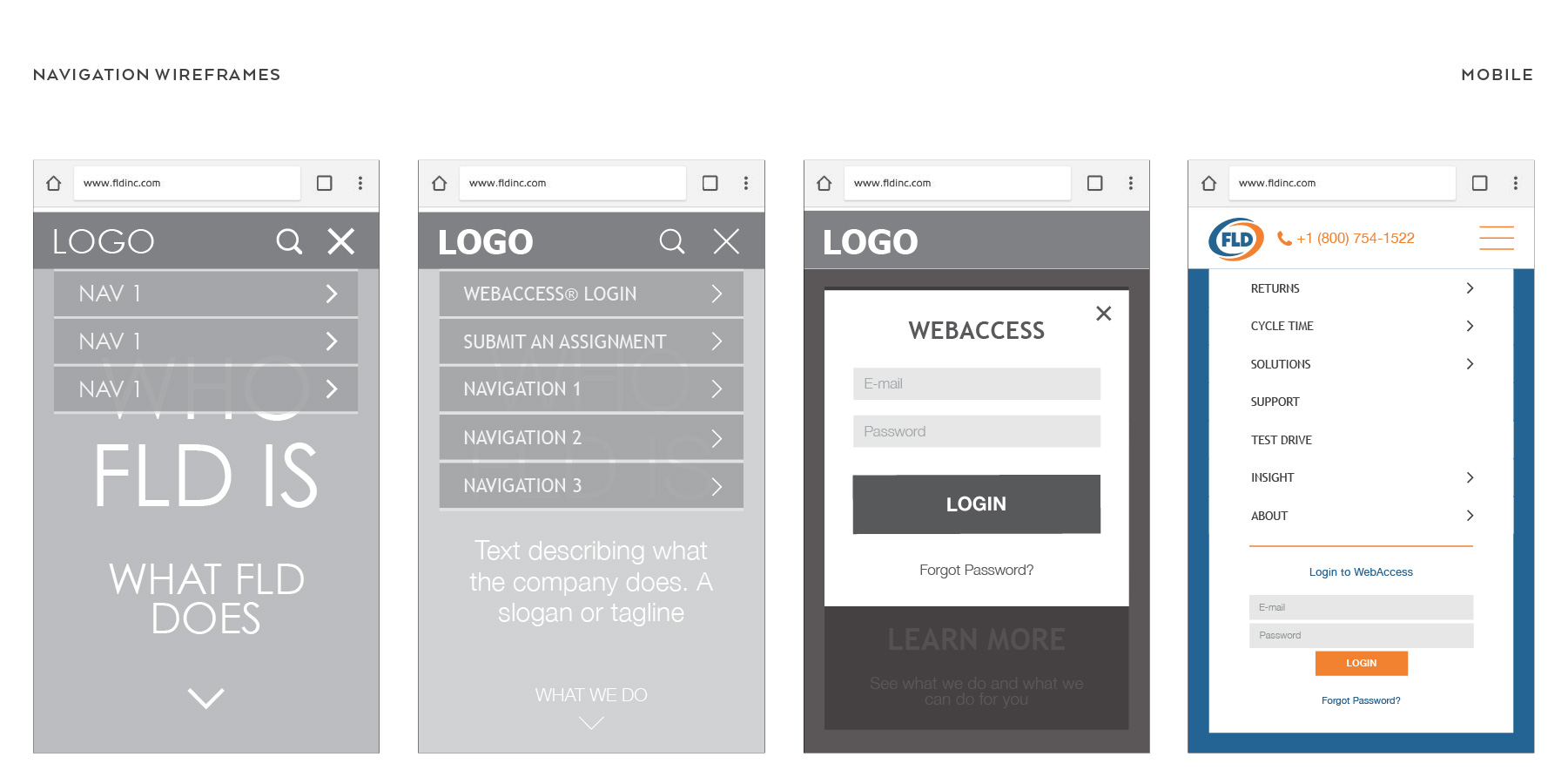
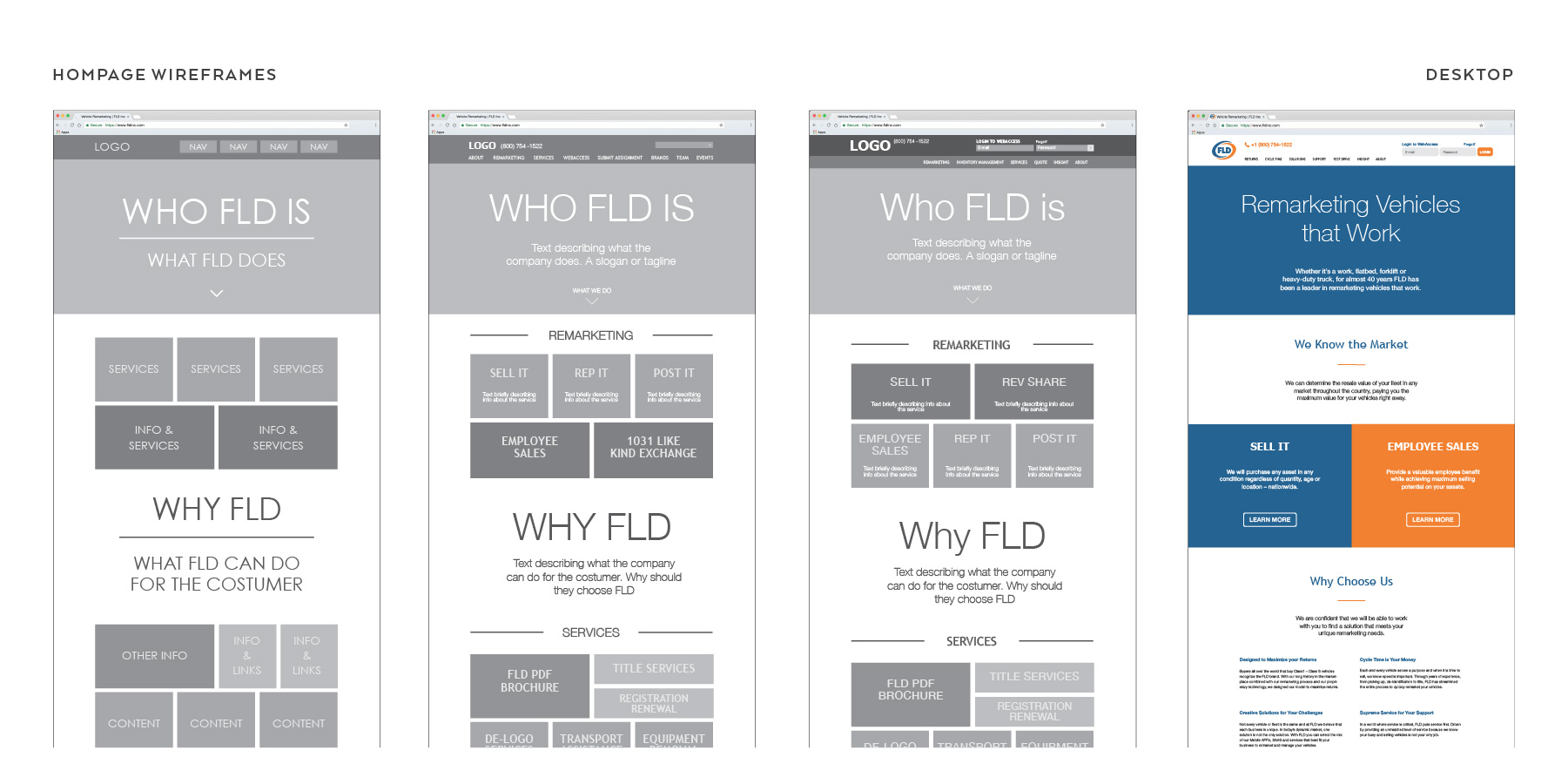
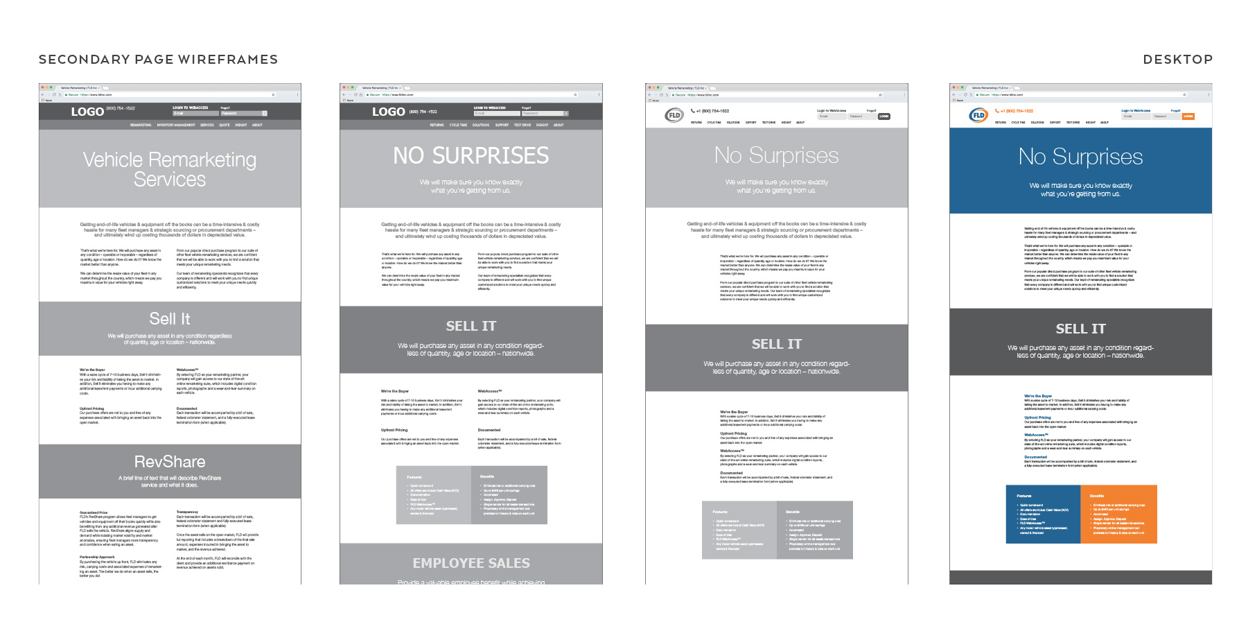
The image above and the 4 below portray brief overviews of the evolutions my wireframe designs for the website underwent over the course of the rebranding project. I worked from low fidelity to higher fidelity wireframes and had a fundamental concept for the website layout. I collaborated with the rebrand team to continuously meticulously revise and refine every detail. I initially designed the website for mobile display for simplicity and easability of content organization. Once I had down what exactly will be on the website page, I would then adapt my design for desktop displays.
Once I had a roughly finalized design for the layout of the new website, I began writing the front-end part myself. I worked closely with the IT department to set up everything that was necessary to have the site up and running properly in time for the big deadline. I gained a lot experience and significantly improved my coding proficiency while writing the company website. I obtained a more comprehensive insight on the relationship between back-end and front-end web development and got to witness what it's like to work in the field of web design. I look forward to expanding on my knowledge and skills of web coding and front-end.
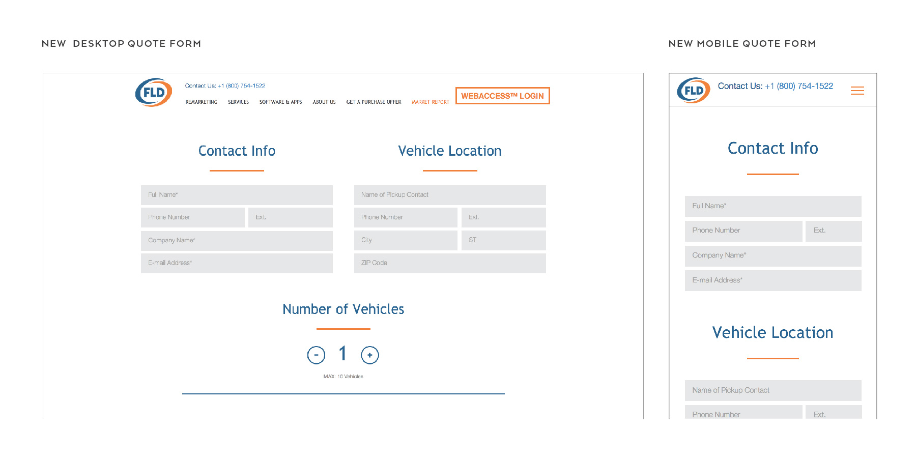
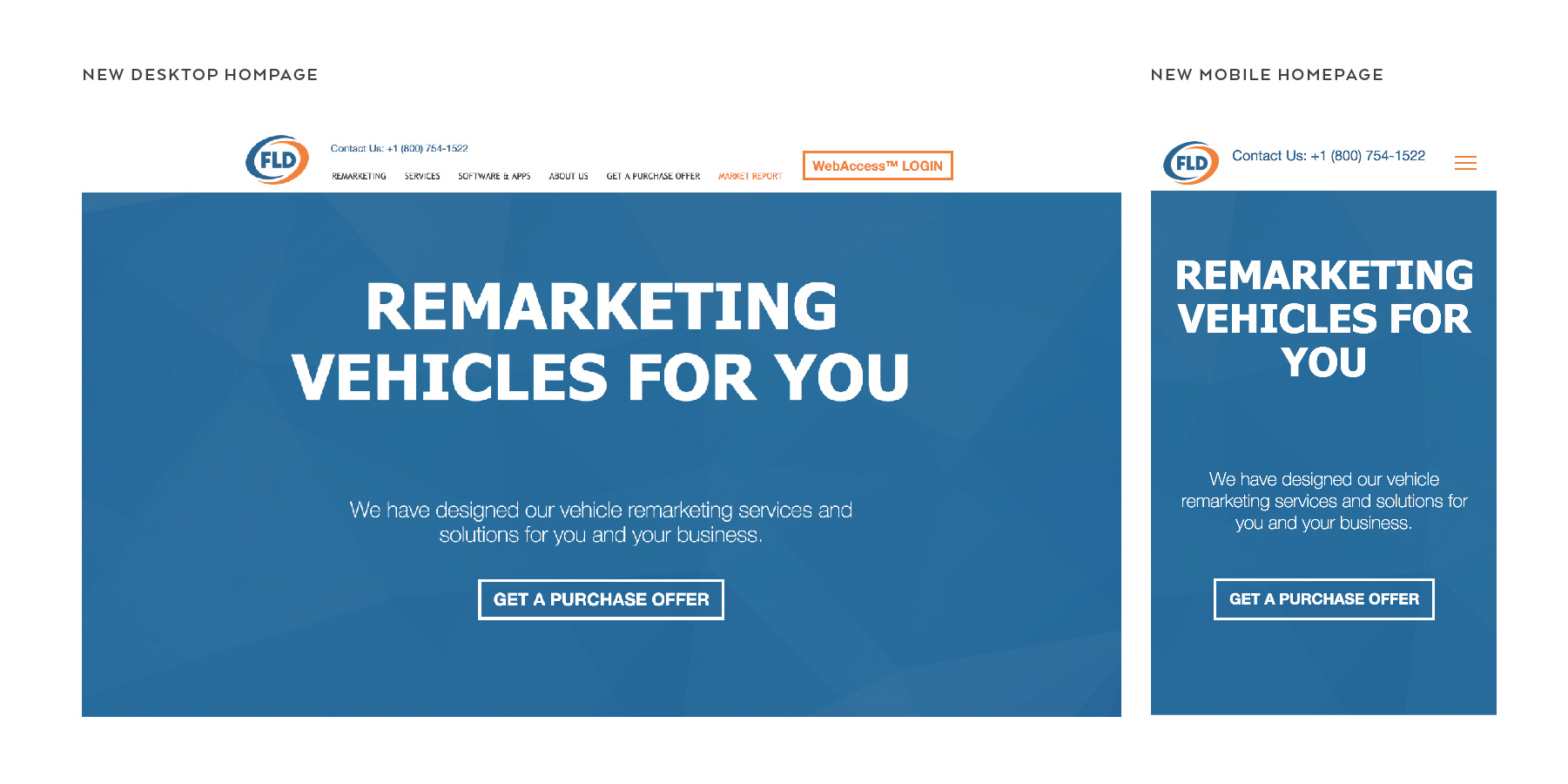
The last two images above portray FLD's current website homepage and quote form and illustrate what they look like on both desktop and mobile displays. You can visit the FLD Inc. webpage at fldinc.com to view my design in application. I continue to work with FLD Inc. in adding site revisions and additional content for the next coming phases of the website redesign, as well beginning to work on projects regarding application development.