Non-Profit Rebrand
I did a series of investigations looking into redesigning the non-profit organization, Earthwatch Institute, brand image & identity.
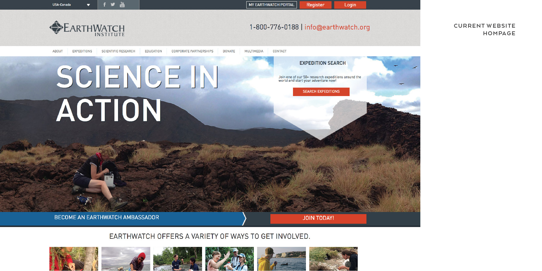
Earthwatch is a non-profit environmental organization focused on connecting everyday people with the world’s top scientists to conduct vital field research. They are one of the largest global underwriters of scientific field research in archaeology, paleontology, marine life, biodiversity, ecosystems & wildlife. The image below portrays the organization's homepage and illustrates their brand image.

After indepthly researching the organization and what they do, I obtained a better understanding of who they are and their mission. They strive to engage people worldwide in scientific field research and education to promote the understanding and action necessary for a sustainable environment. The Earthwatch community rapidly and continuously grows, with participation from members of the general public they call “citizen scientists,” to corporate employees, to educators and students. Their vision is a world in which we live within our means and in balance with nature. This mood board helps illustrate the aesthetic and personality I originally envisioned for the organization based off what I learned about Earthwatch.
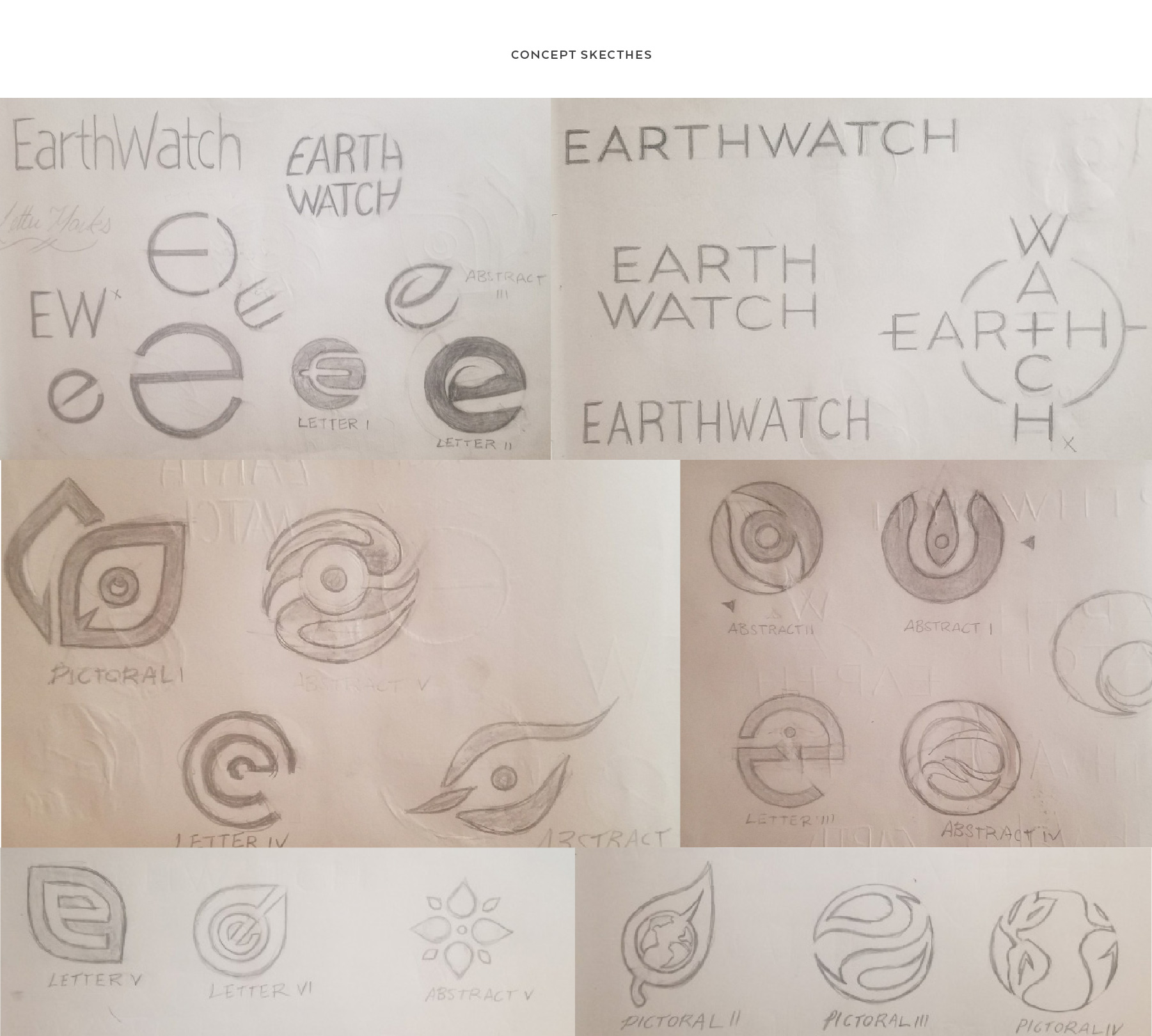
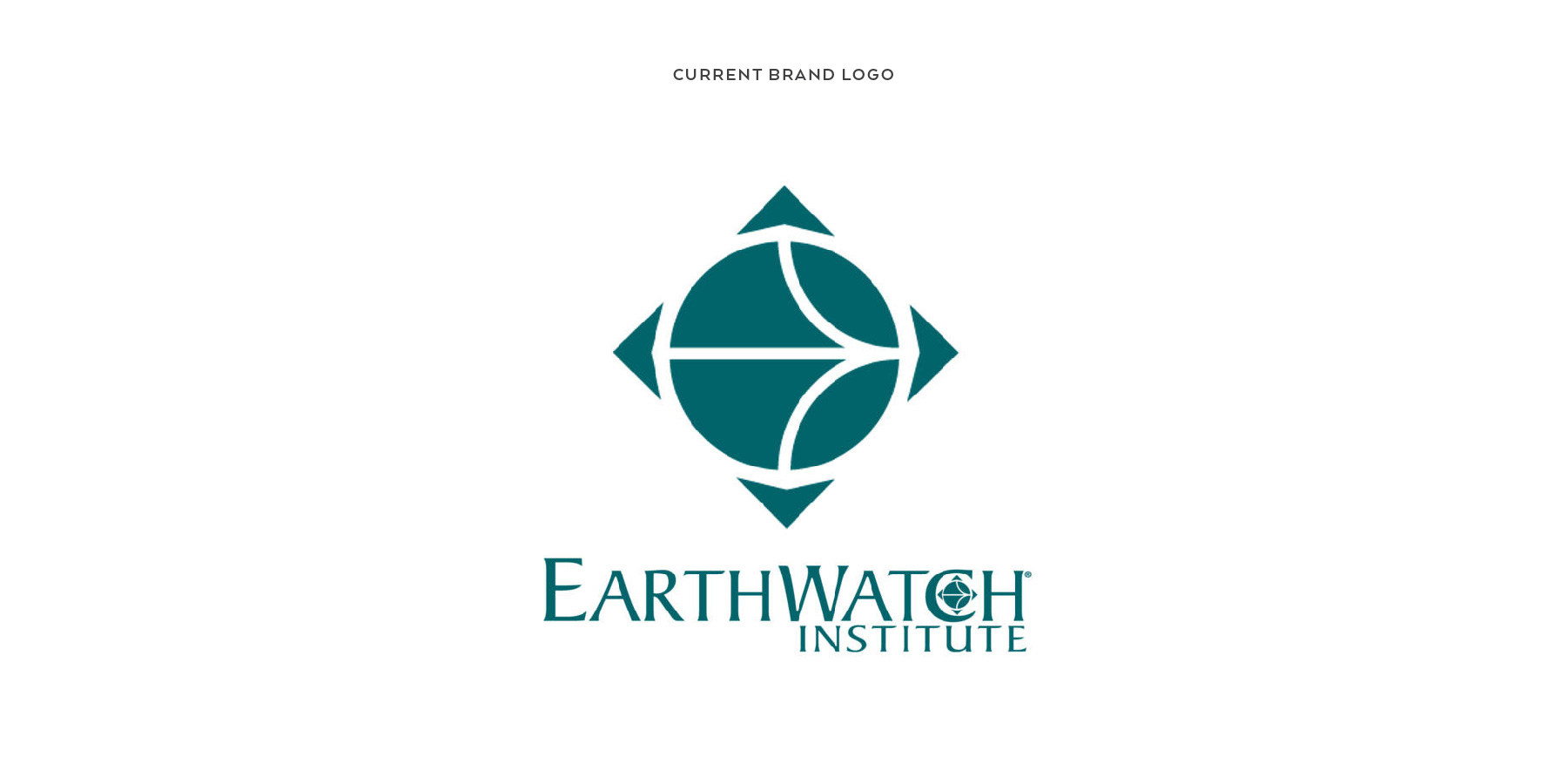
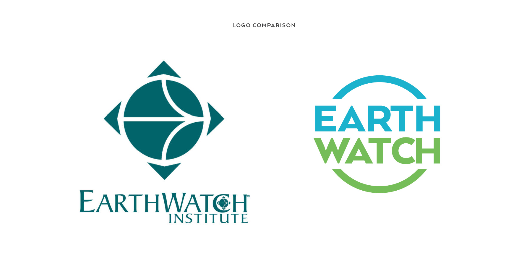
Coming up with a logo solution was certainly a challenge for me. The current brand logo seemed too abstract and there were several concepts I had in mind that could potentially better represent the organization. I explored a large number of letter, pictorial, typographic and abstract marks to consider for the logo design.
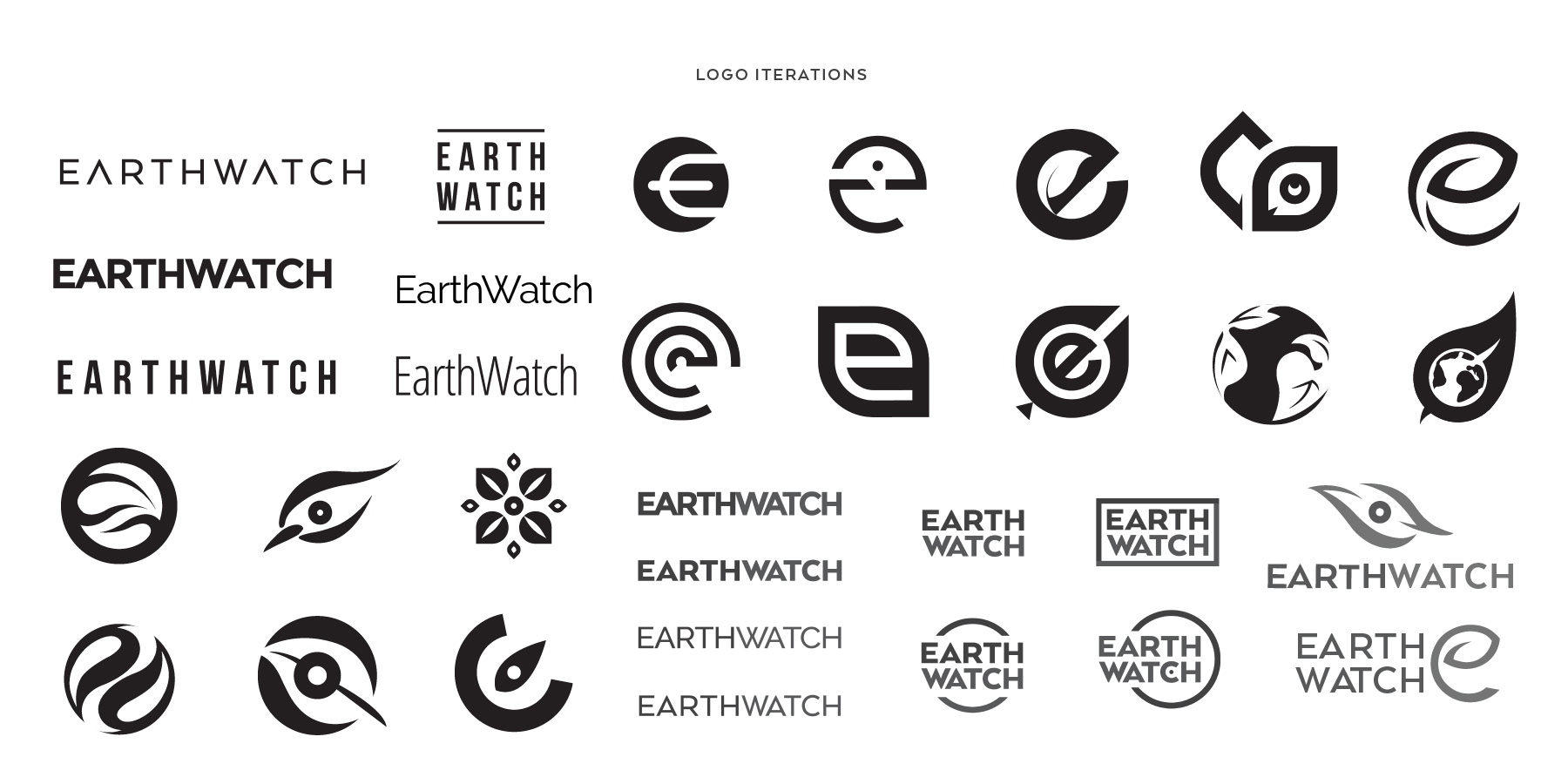
I refined my original concepts and continued to experiment and investigate several different approaches. I looked at various symbols relating to the earth, eco-friendly, and globalization. I also combined and observed relationships between typography and graphic marks.
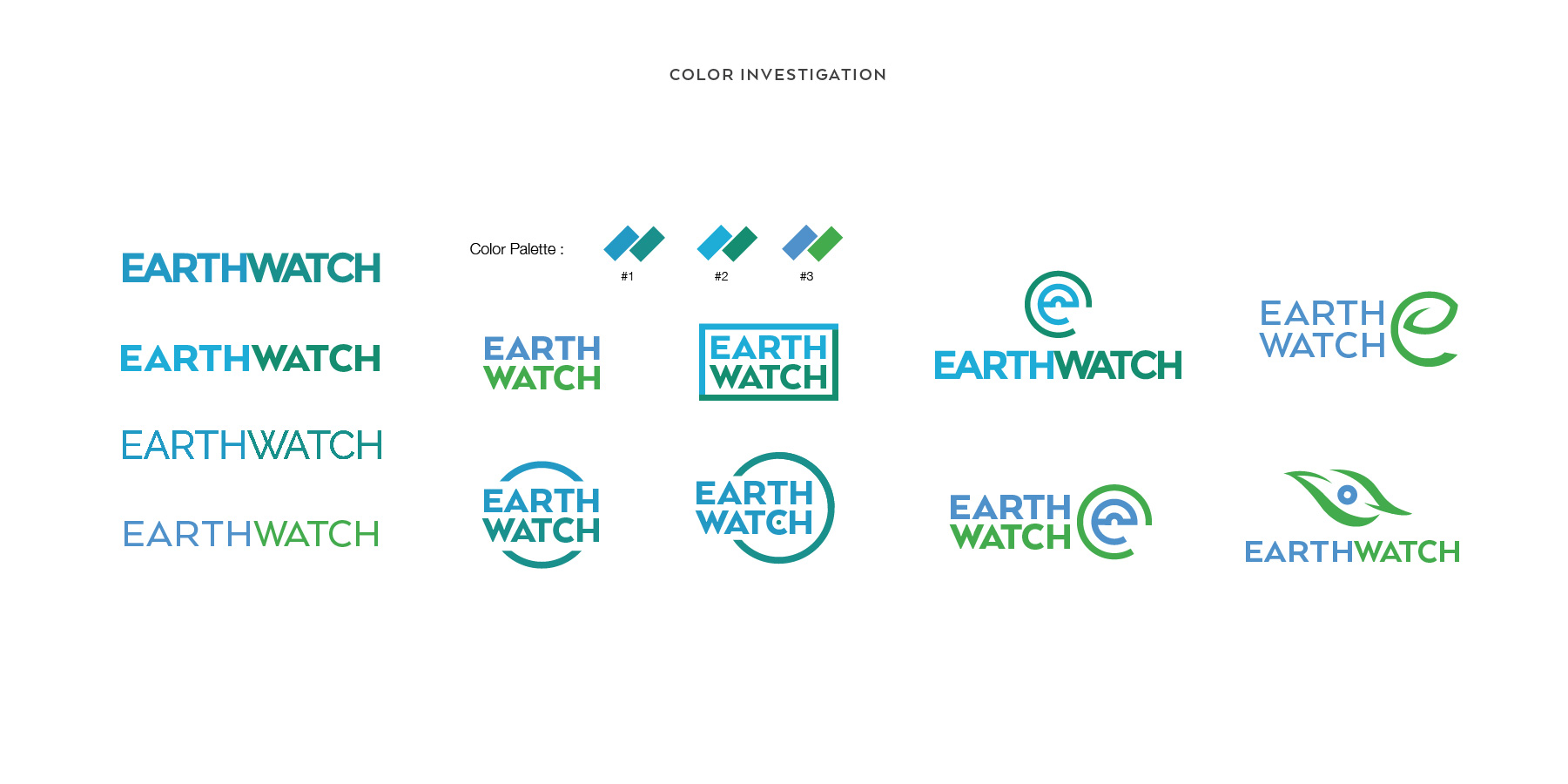
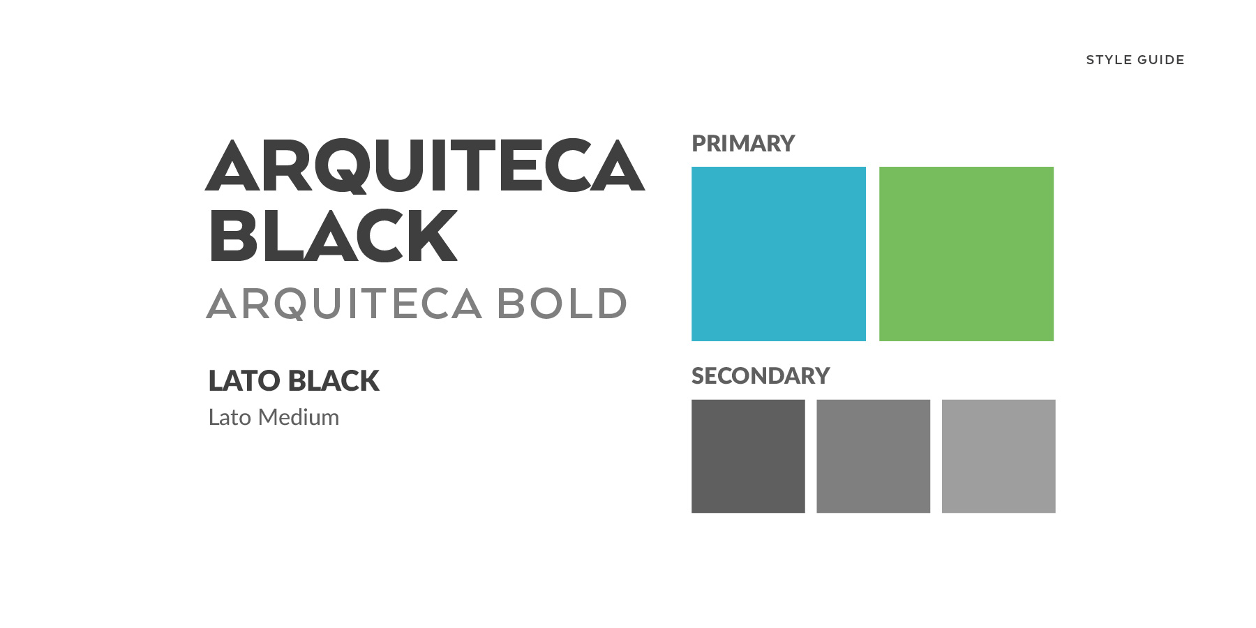
While further revising my designs, I then began investigating color schemes for the new brand. Refering back to my moodboard, I wanted to depict colors that resembled the color of the planet, mainly blues and greens.
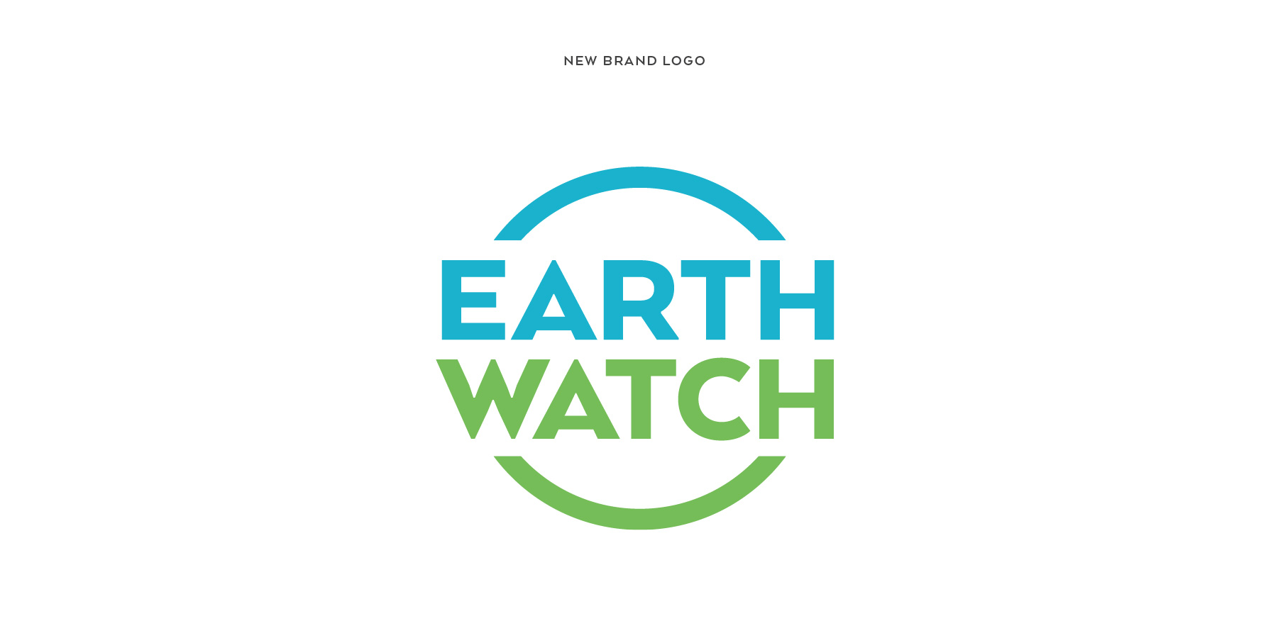
The finalized logo accurately depicts what I had envisioned as the logo for Earthwatch. I was attempting to make a more evident visual connection that Earthwatch deals with issues regarding the planet and sustainable environment.

The idea behind the brand tagline was to briefly, directly and explicitly convey the purpose and mission of the organization. The positioning statement that I had come up with was, "Only Earthwatch engages individuals from all walks of life in scientific field research and education to promote the understanding and action necessary for a sustainable environment."
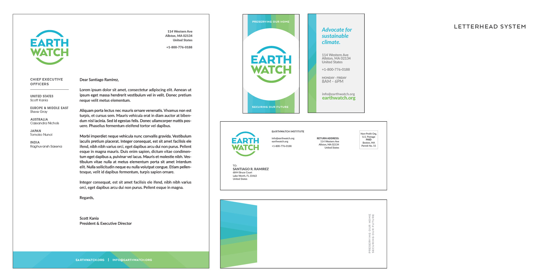
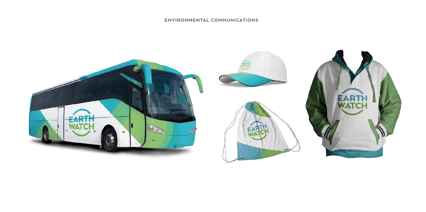
For the brand image, I created a gradient-like pattern using transparencies composed of only the blue and green colors derived from the logo and layered them over each other; stemming from the idea of interconnectivity and globalization. The blue/green pattern complements the visual connection of the brand to the earth and to what Earthwatch is for.
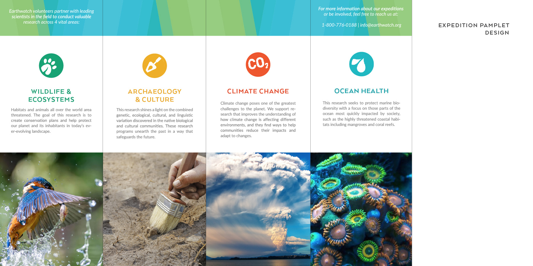
Earthwatch volunteers partner with leading scientists in the field to conduct valuable research across four vital areas. The image above is a pamphlet design providing information on those areas with links and contacts for people who are interested in participating as a volunteer.
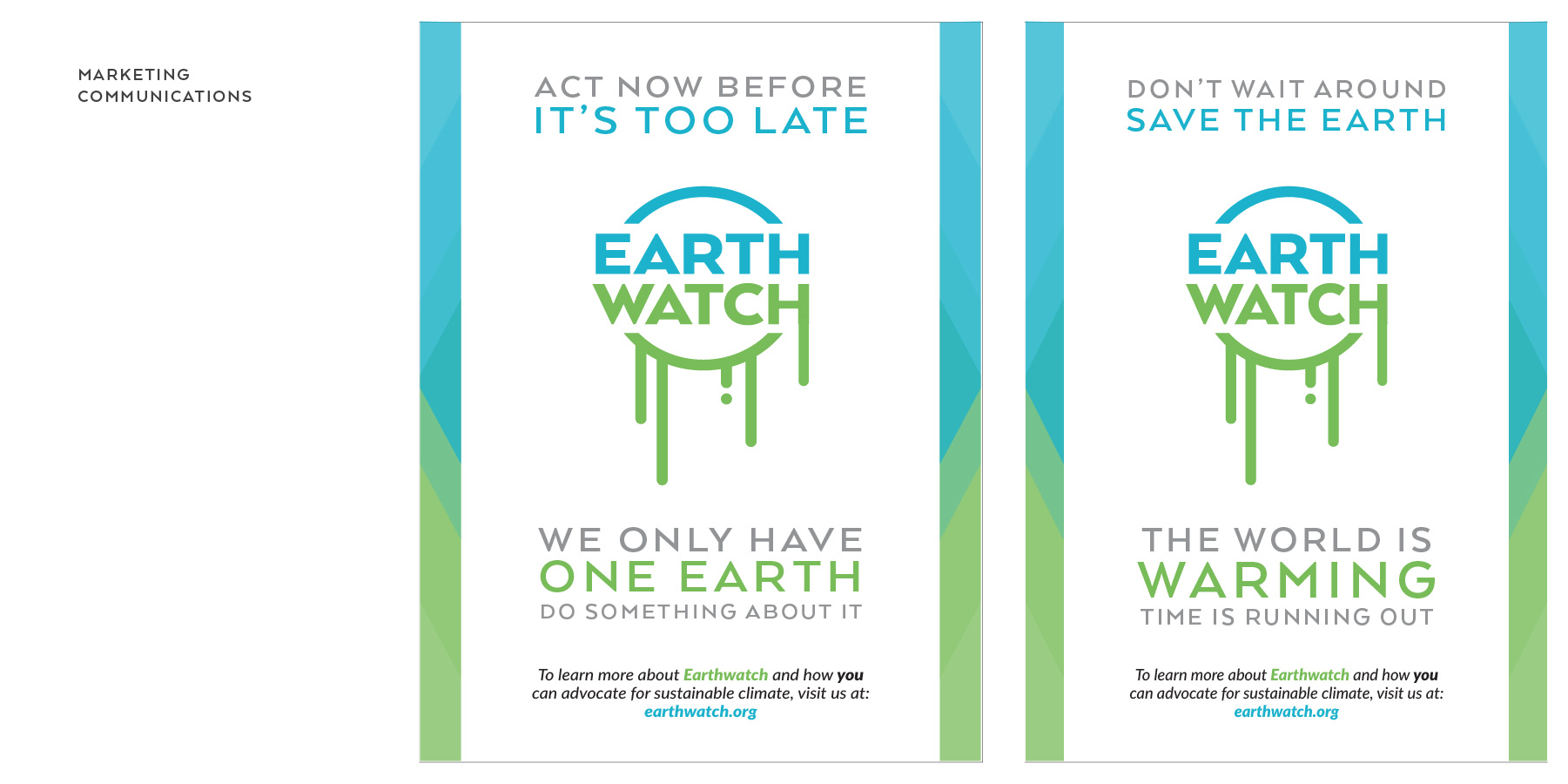
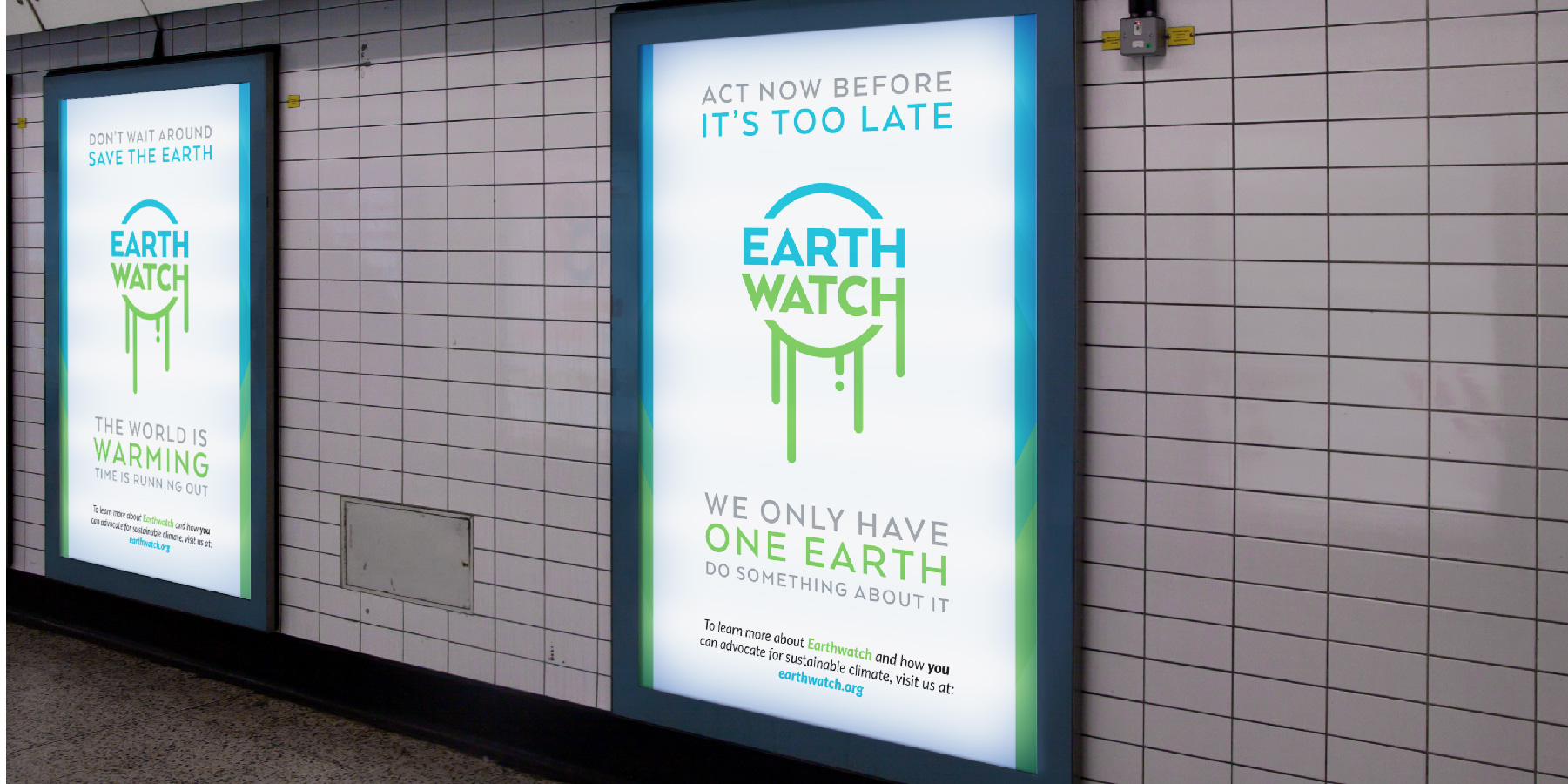
For an Earthwatch advertisement poster, I took advantage of the logo's resemblance to the earth and designed it to look like it was melting. It regards to the issue of global warming and climate change, which Earthwatch is highly proactive for. I used a more urgent and commanding tone with the messaging because I wanted to convey the point that everyone shares this planet together and we as its inhabitants are responsible for taking care of it. It is our home and we have no other alternative.
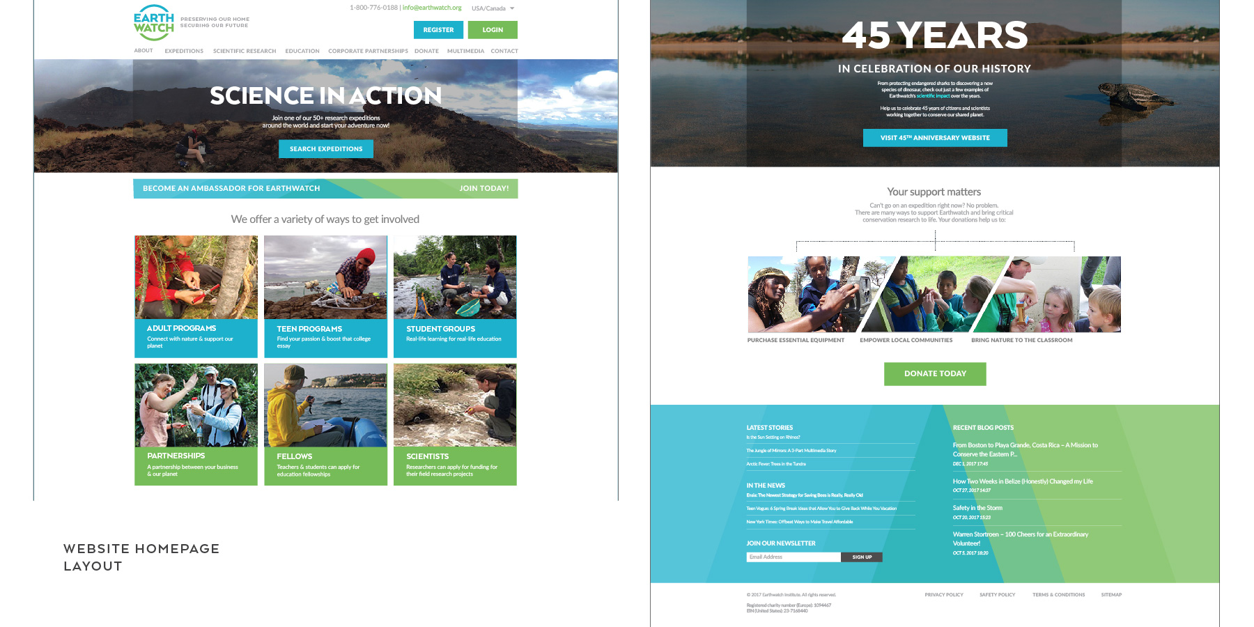
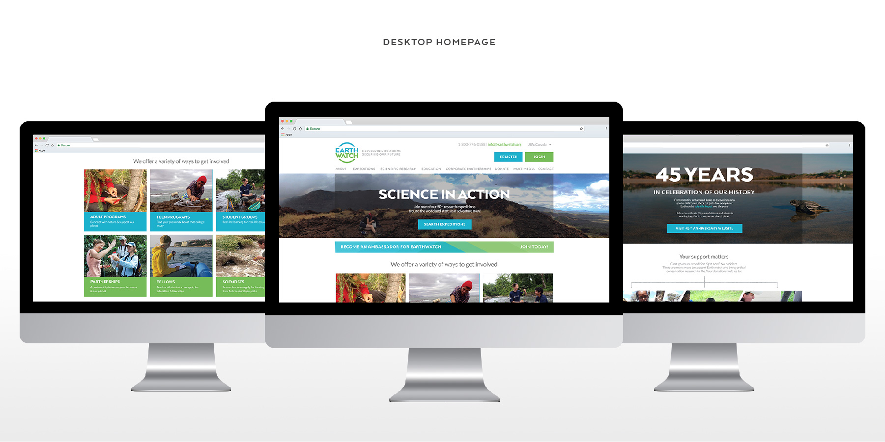
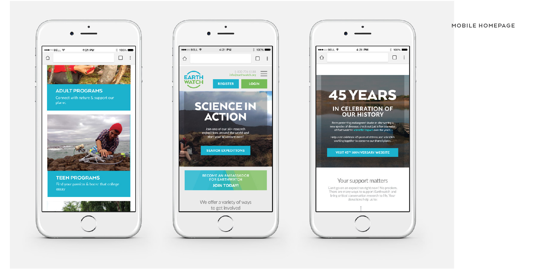
I designed a layout of the organization's homepage with my brand image applied to it. The current Earthwatch website as is does not respond to mobile display, so I figured I'd design a mobile layout of the website as well.